Design System
Built Roofr's foundational design system, then led the rebuild using Figma variables and slots. 400+ components, 20,000+ weekly inserts across product and marketing teams, and instant dark mode through token-level mode switching.
Case highlights
20,000+
Weekly inserts
org-wide consumption across product + marketing
400+
Components
shipped across product surfaces
341,000+
Yearly Button inserts
across 220 variants, the most-used component
Roofr’s design team was rebuilding the same UI primitives across every project: buttons, form inputs, typography ramps, color applications. Sprint capacity went to component recreation, not product work. Engineering had no authoritative source for what “Roofr UI” meant.
I built v1 solo, prioritizing components by actual insertion frequency, not by what felt foundational. v1 served the org for 2.5 years and reached 20,000+ weekly inserts at peak. The usage data was the argument that earned a team-wide v2 rebuild.
v2 focused on Figma variables and slots. Mode switching lives at the token layer, so dark mode is a byproduct of the architecture. v2 has 4x more variables (117 → 476) and 80% fewer styles (116 → 26): variables absorbed what static styles used to do, and every component inherits automatically.
- Sprint capacity wasted by component recreation. Each project rebuilt similar pieces with minor variations.
- UI inconsistency across features created maintenance overhead for both design and engineering.
- Quality and accessibility standards varied meaningfully across product areas.
- Engineering had no source of truth for what “Roofr UI” meant; component-library decisions kept getting relitigated.
For Roofr’s product-team size, it was all about velocity. Every new feature paid a re-invention tax. A design system would compound: the more teams using it, the more the foundation paid off, and the faster new surfaces shipped.
Launch
Adoption proof
- 01 Component insertion rates across all product and marketing files.
- 02 Component reuse rate across new feature development.
- 03 Detach rate as a quality signal: low detach means the system fits real workflows.
- 04 Engineering handoff efficiency once the FE library mirrored the DS.
Strategy
Org-wide impact
- 01 Sprint-velocity lift across teams using established components.
- 02 DS as the source of truth for engineering's component library.
- 03 Cross-functional design language so planning conversations land faster.
- 04 Foundation strong enough to support a token-architecture.
- Can’t disrupt in-flight design work. v2 rollout had to happen alongside active product design, not block it.
- Figma capability ceiling. v1 shipped before variables existed at the depth v2 uses.
- Variable architecture is path-dependent. A weak token structure in v2 would cause future problems. The mode and variable model had to be correct.
- FE component library parity. A design system is only effective if engineering adopts the same vocabulary. Tight coordination with FE leads across the rollout.
- Prioritize by actual usage, not by what feels foundational. Data-driven prioritization of what components to spend the most time on.
A full audit of Roofr’s existing designs showed the most used pieces: buttons, form inputs, typography, color applications, all rebuilt constantly with small variations. Foundational primitives carried almost all the load.
Some components are used a staggering amount whereas others are rarely touched. Button alone accounts for hundreds of thousands of insertions. Build priority came from the audit data.
Daily design-team workflow needs were another input. A DS only works if the people consuming it want to use it. v1 was built by me for the team, whereas v2 was built by the entire team.
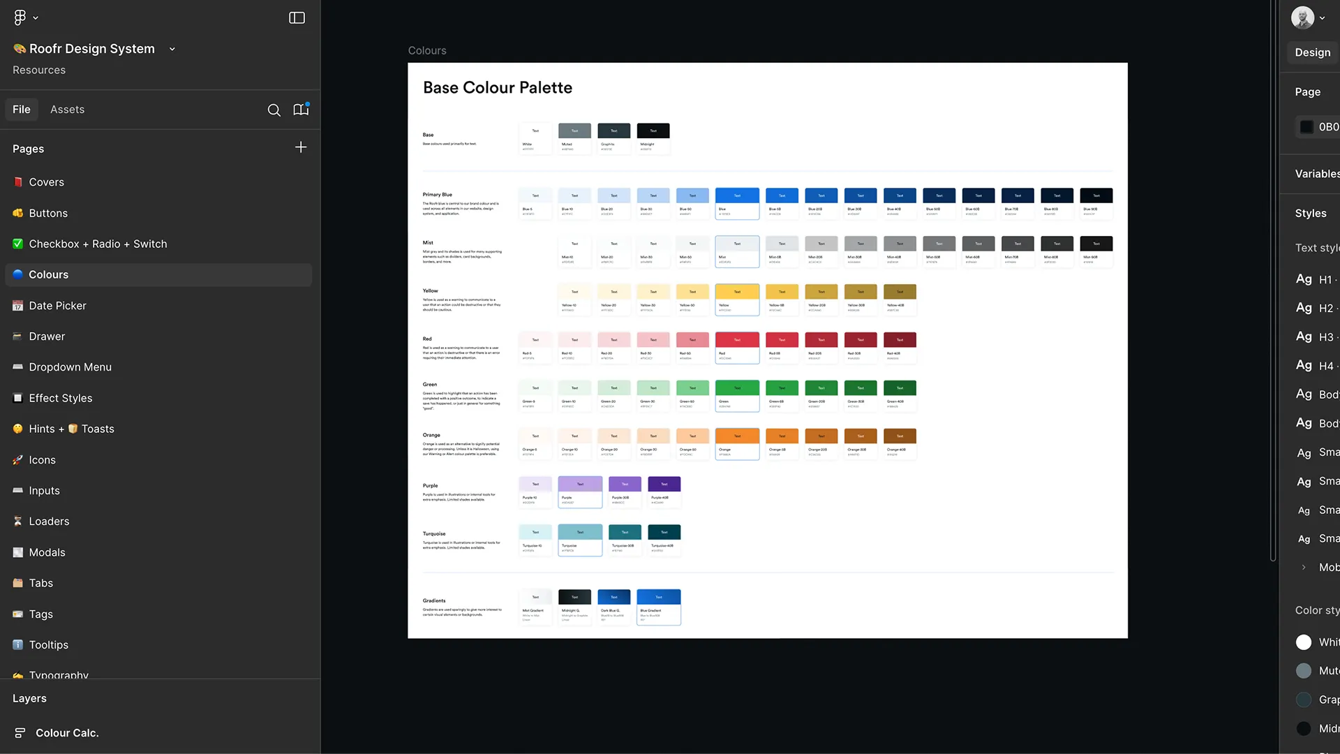
The components below are the foundational primitives, the ones the audit flagged as common. Together they carry the majority of system inserts.
v2’s best practices decision: mode switching lives at the token layer, not the component layer. Every component reads from semantic variables that resolve differently per mode. Light and dark are byproducts of the same component definition.
LOOP Input
Form-control input with label, helper text, and validation states. Built early in v1 because input rebuilds were one of the top sources of design-team rework.
LOOP Button
Button component, the most-inserted artifact in the system. 220 variants cover size, intent, icon affordances, and loading states.
LOOP Hint banner
Inline hint banner used for non-blocking guidance and contextual upgrade prompts. Calibrated to feel informational, not interruptive.
REEL Section-level mode switching
Two surfaces in the same canvas, each rendering its own mode. The variable model lets product teams design dark and light states without duplicating components or maintaining parallel files.
REEL Single-toggle full-screen swap
Full screen flips light to dark with one switch. The proof of the v2 architecture: zero additional design work per component, mode resolves at the token level.
Prioritize by insertion volume
Build order set by frequency-of-use in the existing Roofr surface. Post-launch usage validated it: Button (341,898/yr), Tags (83,539), Checkboxes (82,240) lead the usage by an order of magnitude.
Variables + modes; dark mode is a byproduct
v2’s most consequential call. Tokens handle mode switching; every component inherits automatically. Instant dark mode across 400+ components, zero additional design work, only possible once Figma shipped the primitives and the token structure was right.
Team-wide v2 rebuild, not solo
Every designer contributed. Two wins: distributed the work and built shared ownership. v2 maintenance is a team problem because the team understood the variable system from the inside.
Foundations over flash
Resisted visually distinctive components that would have made the system more “marketable” internally. Foundational elements (Button, Input, Tag, Checkbox) carry the load. Usage data validated the restraint.
Marketing-accessible tokens
Brand and social designers got typography ramps and brand colors as first-class tokens, not gated behind the product DS.
-
20,000+
Weekly insertions
Org-wide peak consumption across product and marketing. 16,100/week sustained during the v2 migration window.
-
400+
Components
v1 at 417, v2 at 409. Input, navigation, feedback, data display, and compositional primitives.
-
341,898
Yearly Button insertions
Across 220 variants. Most-used component; foundational primitives carry the volume. Long-tail components rarely break 5,000 a year.
-
0.13%
Button detach rate
On Button (~428 detaches against 341,898 insertions). Low-detach is the quality signal: designers stay in the system because components fit real workflows, not because policy forces them.
-
8 teams
Org-wide adoption
Product + marketing teams using the published library across v1 and v2.
-
805K / 277K
Yearly team breakdown
Roofr Product 805,674 yearly insertions (74%); Roofr Marketing 277,757 (26%). Marketing adoption was the surprise; validated treating brand-adjacent tokens as first-class system citizens.
-
4x / −80%
v2 architecture shift
117 → 476 variables (4x); 116 → 26 styles (−80%). Static styles got absorbed into the variable system, which is what enables instant mode switching across the whole component set.
-
5,100/wk
v2 ramp
3 teams adopted so far, ramping out of v1. Insertion volume tracks tier-by-tier migration rather than big-bang switchover.
-
Instant
Dark mode
Token-level mode switching: every component inherits automatically. Zero per-component duplication.
-
Source of truth
FE component library parity
Design system became the engineering reference, not a parallel design artifact.
- Lead DS metrics with usage volume, not component count. 400 components is a meaningless number, whereas 20,000+ weekly inserts is impactful.
- Usage data earns resources. v2 got team-wide resourcing because v1’s adoption was undeniable in the analytics. The strongest DS argument is empirical.
- Variable architecture is where the time goes. The right token model turns dark mode from a duplicated component set into a byproduct.
- The edge cases don’t matter as much as you think. The foundational ~10% of components account for the vast majority of insertions. Resist building rare components until they’re actually needed.
- Cross-team adoption is the real validation. When marketing starts using the DS, the system has outgrown its original scope. Design for that from day one.
- If repeating: instrument usage analytics from day one of v1, not retroactively. Earlier data would have made the v2 resourcing argument easier.
Post-launch. v2’s variable architecture is the foundation every new product surface inherits. Storybook and the production component library are migrating to match; on the design side, v2 is the current system of record.
The charts below back the headline metrics on the public card.
Deep dive
Curious about the specifics?
Adoption cohorts, revenue pivot data, prototype walkthrough videos, and the internal PRD are available on request during a portfolio review.